Tree Diversity

WELCOME TO THE LAST BLOG!

sad cry GIF by SpongeBob SquarePants Giph by spongebob

In today’s final blog, we’ll be discussing tree diversity!

I can’t stop thinking of Christmas trees! I smell Pine everywhere I go!

christmas tree GIF Giph by Giphy

For the lab, we actually went off campus! We traveled to a trail about 10 minutes out. When we got there, the first thing I noticed was how wet the ground was. If I remember correctly, it rained a couple days before the lab. It was also really cold outside with some occasional winds. No one could feel their toes after about 30 minutes outside! Other than being a frequently used trail, there were no other obvious signs of disturbance. I’m sure the forest could have been a little more dense if they put fences along the trail. It was also difficult to tell since the leaves have fallen off the trees and a lot of dead plant material remained on the bed. All the trees were relatively small. However, this could’ve simply been the area we chose. Another part of the trail seemed to have way bigger trees.

The goal of the lab was to observe species richness. In groups, we did this by using transects. There are two types of transects: Line transect and belt transect. A line transect, which is what we used, is when samples are taken along a straight line on either side of the transect at certain intervals. Belt transect is similar but involves quadrats. Instead of just using a line and counting the samples along the line, quadrats are used to get a bigger sample of data. This process takes longer but gives more complete data. However, for time’s sake, we simply used the line transect.

We started by finding a good spot along the trail that wasn’t too dense with trees, but not too sparse either. We just had to be able to walk through relatively easily. When we found a spot, we measured out 50 meters (165 feet) using a transect tape into the interior of the forest. Once that was laid out, we flipped a coin to find out which side of the transect line we were measuring on. For my group, heads was to the right and tails was to the left. Once the direction was figured out, we would use a 1.5 meter (5 foot) string and taut the strong out from the transect line. We would then proceed to count every different tree species that touched the taut string at every 1.5 meter (5 foot) interval.

Disclaimer: The worksheet we used had some typos in it and didn’t record the line transect at 75 and 95 feet. That’s one error we might want to consider when looking at our data. I don’t think it would be a massive difference but everything counts.

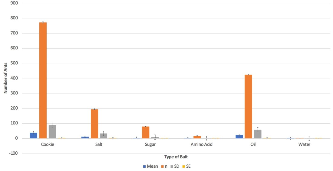
Here were our results!

As you can tell from our scatter plot, there is a slight positive correlation when comparing number of tree species to the line transect.

Tree Diversity Results

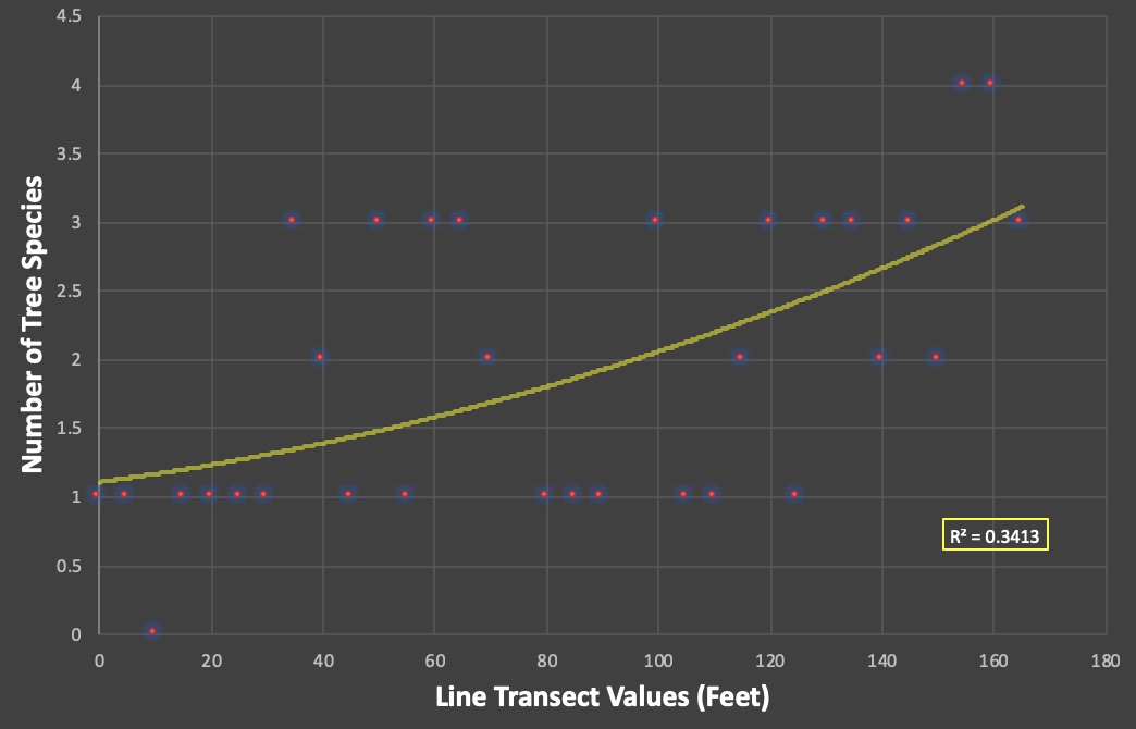
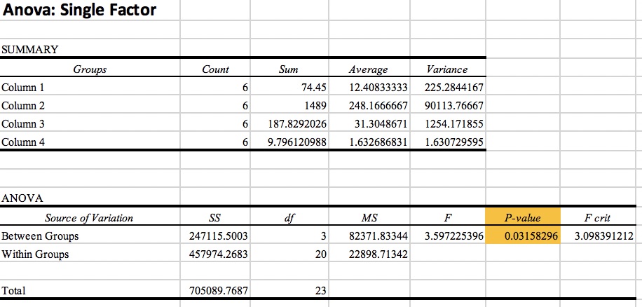
This means that the farther we move into the interior of the forest, the more species we see. Because the r-squared value is 0.3413, this shows us that the pattern is weaker than it is strong but it is not absurdly weak. To better understand this, we needed to run a regression analysis. We only need to pay attention to the p-value.

Tree Diversity P-Value

The p-value is below 0.05 which means it is statistically significant!

Habitat fragmentation greatly effects species diversity. According to a peer reviewed article called Habitat fragmentation, Tree diversity, and Plant Invasion Interact to Structure Forest Caterpillar Communities by John O. Stireman III, et al., “habitat fragmentation and invasive species are two of the most prominent threats to terrestrial ecosystems”. A lack of species diversity causes more problems than you think. Because there aren’t as many species of trees available, this means that there can’t be a very diverse number of organisms either. In Stireman III’s study, they noticed that when there was an abundance of Honeysuckle, caterpillar numbers and diversity would decrease (Stireman III).

Here’s another example of the effects of habitat fragmentation:

There’s an article called Gene Flow Halted by Fragmented Forests by Asian Scientist Newsroom that discusses the endangered maple tree and how it has been affected by habitat fragmentation. According to the scientists, they believe that the conservation of river floodplain ecosystems could maintain the genetic diversity of these maple trees. Because of this, these maple trees are important as reservoirs of genetic diversity and therefore should be conserved. When the scientists conducted an experiment comparing young and old maple trees, they noticed that the small, young trees had a higher level of genetic differentiation compared to the older maple trees. This leads us to a bigger picture… What is helping promote diversity? Well, if there is a river somewhere, the water, carrying all sorts of nutrients, minerals, and organisms helps out more than one can imagine. This is why many people are trying to preserve forests along rivers. This gives this area an advantage and promotes genetic diversity that other forest patches would not have.

Overall, tree diversity is such an important subject that requires patience and a lot of knowledge. Let’s just say that you need a lot of diverse information. Ha, get it? Ok, i’ll show myself out now…

Anyway, this is the last blog! Thank you for being part of the blog family! Hope you enjoyed everything you read!

john oliver goodbye GIF

Giph by Giphy

-Louanne Maes

Peer Review Citations

Stireman, John O., et al. “Habitat Fragmentation, Tree Diversity, and Plant Invasion Interact to Structure Forest Caterpillar Communities.” Oecologia, vol. 176, no. 1, 2014, pp. 207–224.


Advertisement

Where Does Your Cat Go?

bored cat GIF Welcome Back

Giph by Giphy.com

Hint hint. I’ll be talking about cats!

Cats can be very sassy so I thought that picture was an accurate description of how a cat would act.

Felis catus (cats) are very interesting creatures. They’re the only domesticated animal that a lot of people will let freely roam. Have you ever wondered where your cat went? Do they go far from home? Do they stay in the neighborhood? What about all those times where your cat brought you back a “present”? Where did they get it? Did Ms. FluffyPants stay in an urban area? Did Mr. PussInBoots go out in the woods?

puss in boots orange GIFGiph by Giphy.com

People were given the opportunity to find out! Using radio telemetry, scientists and the cat’s owners were able to track their cat’s home range or area. In this lab, we used Google Earth Pro, MoveBank.org, and EarthPoint. MoveBank gave us all the data we needed for each country we looked at (USA, Australia, and New Zealand). MoveBank would then direct us to Google Earth Pro to look at the area visually. After the home range was found, we would copy and paste a computer code into EarthPoint; a program that uses the polygon given to spit out an area in hectares. For every country, we would record 15 cats. So in total, we recorded the home range for 45 cats.

Knowing general information about these countries, it was interesting to guess which location would have the most “urban” or “rural” cats. I personally guessed that the USA would have the highest average home range but would still stay pretty urban. I guessed that Australia and New Zealand would have more rural cats but wouldn’t go very far since the terrain might be a little more dangerous for the average house cat.

Let’s look at the results!

We first found the average area for each country. We then applied it into a bar graph.

Screen Shot 2018-11-26 at 6.49.48 PM

As you can see from the bar graph above, my prediction seems to be right about the average home range. The USA seemed to average out higher than Australia and New Zealand, but the error bars still need to be taken into consideration. All of them are overlapping so it does not necessarily mean that the USA had a higher average than the rest. So is it statistically significant? We used the Anova single factor test to find out.

Anova Test For Cat Tracking Lab

As you can see from above, the p-value is way above 0.05. Therefore, the data is not significant. If we had a way bigger data set, maybe we would have gotten different results. As for these 45 cats, the home ranges in different countries are not significant enough to compare.

Based off of Google Earth Pro, most of the USA cats stayed very urban but would go out farther than the others. In Australia, the cats seemed to go into more rural areas, but not enough to be very noticeable. They still seemed to stay relatively close to all the neighborhoods. New Zealand, however, was the most rural of all three. If a house was near the woods or a mountain, I noticed the cat would either go inside the forested area or outline the side of the mountain to a certain extent. Some even seemed to be climbing the mountain, but none went very far.

Overall, most of the cats in all three countries stayed in an urban environment. This seems pretty natural to me if the cat is used to being both indoor and outdoor. The cat knows it doesn’t need to go very far from home if it being fed by its owners. Even though a lot of the cat’s actions are instinctual, a part of it might just simply be curiosity rather than the need to survive.

Some abiotic factors that could potentially affect a cat’s home range includes: buildings, roads, houses, etc. Biotic factors could also influence a cat’s home range. This can include other cats and other animals in general. Cats tend to be very territorial, thus possibly limiting a cat’s potential area if come in contact with another cat. Though most cats are probably used to being surrounded by roads, houses, and other buildings, they still know when something is dangerous to them, therefore they tend to avoid roads, thus also limiting their home range. However, breeding season should also be kept into consideration. Though I do not have information on the cat’s sex, I would assume males traveled farther than females in order to mate.

Cats have become a very common pet for people to have. Though a lot of people have confined their cats to being indoor only (which can be a very good thing), a lot of people still let their cats roam free. Is this damaging to the environment? YES.

Although it does not cross a lot of peoples’ minds, outdoor cats HEAVILY influence the environment. According to a peer reviewed article called The impact of free-ranging domestic cats on wildlife in the United States, the authors claim that 1.4 – 3.7 billion birds and 6.9 – 20.7 billion mammals are killed by cats annually. However, the majority of these killings were done by feral cats as opposed to owned cats. Nonetheless, domestic cats are said to have contributed to 14% of the bird, mammal, and reptile extinctions. I knew that cats could have an impact on the environment, but I personally would have never guessed how big of an influence they had. If I compare my results to this study, I have a hard time proving anything. Since I simply looked at the home range and not the actual footage from the cameras attached to the cat, it’s impossible to tell if the cat had an ecological influence. However, if I had footage of all 45 cats, I could tell you how many of them were hunting for prey.

I’ve always wanted a cat… I’m pretty sure I’ll keep it inside if I ever get one now. Of course, there will always be people advocating for the other side. Understandably, a lot of people want to let their cats roam free because it’s sad to think of an animal being confined for its entire life. The best advice I could give is simply to fix (neuter or spay) your cat, no matter what.

If I had to think of something that would please both cats and the local environment, I would build what some shelters even have today. Some people call them “catios”. It’s like a patio, but for your cat!

Image result for catios Photo by Cynthia Chomos

There are so many advantages to this!

  1. Your cat gets to be outside with fresh air
  2. Your cat is entertained by the moving environment
  3. Your cat doesn’t risk getting hurt through disease or other risks
  4. The outside environment is protected from your cat

Though theres clearly a big con… Money. This looks quite expensive. Maybe you could make it a project to make one out of wood?

In summary, cats are very curious creatures that are invasive. It is our job to protect the environment as much as we can. This includes taking care and controlling our pets. The first thing everyone should do if adopting a pet is to neuter or spay. Maybe one day, cats wouldn’t be considered invasive. Following cats around a natural environment is a good way to research their habits.

Hope you guys enjoyed this weeks blog! See you next week!cat love GIF by Pamily Photo by Pamily

Works Cited

Loss, Scott R, et al. “The Impact of Free-Ranging Domestic Cats on Wildlife of the United States.” Abcbirds.org, Macmillan Publishers Limited, 29 Jan. 2013.


The Diet of a Barn Owl

What’s a Barn Owl’s favourite Party food?
Mush’Shrew’ms, ‘Vole’avaunts and Micecream!

(Joke by The Barn Owl Trust)

Welcome back! Did you like the joke? I liked the joke, sorrynotsorry.

In this week’s blog, we’ll be talking all about a Barn owl’s diet and food webs!

First of all, look at this majestic creature!

Image result for barn owls Photo by Lehigh Valley ZooBarn Owl Adult Photo by Darren Clark

Barn Owls are fascinating creatures. They are nocturnal apex predators and are excellent hunters due to them being almost completely silent when flying. For most birds, the air turbulence caused by flying creates sound. For the majority of birds, the bigger they are, the more sound they make. However, Barn Owls, and Owls in general, are different. According to Krista Le Piane, a graduate student at the University of California, explains that “owls have a suite of unique wing and feather features that enable them to reduce locomotion-induced sound”. We could get way more specific about this and frankly write a whole blog, but this isn’t the main point for this week.

Barn Owls give researchers a good indication of other organisms in a habitat by their diet. Like the joke above said, Barn Owls mostly eat shrews, voles, and mice. Of course, they’re not that picky and will also eat rats, moles, gophers, small birds, reptiles, amphibians, etc. However, if a habitat is thriving, they are more likely to eat rodents. They will eat reptiles and amphibians if needed, but it’s usually not their first choice of food.

If you look at a food web (for a Barn Owl), which is basically a bunch of interlocking food chains put together, you get this:

Image result for barn owl food web Photo by The Barn Owl Trust

When Barn Owls eat their food, they cant digest everything. Like most birds, they simply swallow their prey whole and let their organs do the rest of the work. In the Barn Owl’s case, their gizzard processes what is consumable and stores the rest of it away for later excretion through the form of a pellet which they throw back up. The pellets usually contain skulls, teeth, other bones, claws, fur, and feathers.

In the lab, we dissected owl pellets to see what we were able to find! We kept track of approximately what bones we found and also based on the bones and skull, what prey the owl may have eaten. Based off of this data, we were also able to give a rough estimate of what region the owl could’ve been in.

I personally had two pellets but some other people in my class only had one if their pellet was relatively big. Here were my personal results!

Down below is a pie graph of which bones I found in my pellets and another pie graph of which prey I found.

Barn Owl - Types of Bones (My Data)

Barn Owl - Type of Prey (My Data)

As you can tell, ribs were the most common bone found in the pellets. This seems pretty normal to me considering there are about 13 pairs of ribs (at least in mice) in each animal the Barn Owl eats. I naturally expected the ribs to be the most common found bone. In my two pellets, I found 4 skulls. 3 of these 4 skulls seemed to be from some sort of rodent (I think one was a rat based off the size), whereas the one remaining skull seemed to maybe be a Shrew.

Based off of the prey, I guessed that the pellets were from the Southwest, but that’s a very rough estimate. I don’t think I had enough experience or education to make an accurate guess. This would mean the habitat was dry, but I’m not so sure that correctly matches up with the prey found. Things that could help identifying a more specific area would be knowing the specific type of prey and its species. I also found hay in my pellets, so maybe identifying the specific type of grass would help? I’m not quite sure.

Now let’s compare my results to both the 2017 and 2018 class data set!

Here’s the 2017 Class Data!

Barn Owl - Types of Bones (2017 Class Data)

Barn Owl - Type of Prey (2017 Class Data)

Not surprisingly, the class of 2017 also found the ribs to be the most abundant bone found. As for the prey found, rodents were also the most common. Not a surprise there. Shrews were the second most common. Again, not a surprise.

But let’s compare the 2017 class data with the 2018 class data!

Barn owl - Types of Bones (Class 2018)

Barn Owl - Type of Prey (Class 2018)

This result is a little more interesting! Even though the ribs remain the top find, the number of hindlimbs found is not far behind. What’s even more interesting in my opinion was the prey found. Of course, rodents take the lead, but I did not expect the mole to be the second contender. What’s even more surprising to me is how close the percentages are between the shrews and the birds! I did not find any birds in my pellets so it’s fascinating to see the results that other people got.

In everyone’s results, amphibians, reptiles, and insects seem to be missing from the Barn Owl’s diet. However, this could simply be due to the fact that none of us were professional dissectors by any means. A lot of bones were broken when trying to gently tear apart the pellet. Also, we might’ve completely skipped over a crucial bone that indicated a reptile or amphibian. As for insects, they don’t have bones and therefore make it way more difficult to find remains in compressed owl pellets.

In both of my pellets, I found a total of 4 intact skulls. This means that the Barn Owl ate at least 4 animals in a matter of two days if we assume that the owl forms one pellet each day. However, I think we can estimate a higher number of prey in each pellet due to the sheer number of bones found. I will assume there were 6 animal in both of my pellets. So let’s do the math:

1 pellet/day = 3 animals

1 week = 21 animals

1 month (4.3 weeks) = approx. 90 animals

1 year = approx. 1084 animals

1084 animals for ONE Barn Owl! And i’m probably underestimating how good of hunter’s they actually are.

According to the Alabama Wildbird Conservation Association, Barn Owls actually eat up to 6 voles or vole sized rodents every night. This doubles our estimated numbers! This amount of food usually totals 1/3 of their body weight!

Since we’ve talked about Urban Ecology before on this blog, I feel like it’s important to mention the differences between a Barn Owl in a rural habitat compared to a Barn Owl near or in an Urban environment. Remember the bear studies with the restaurant dumpsters? And the coyotes living primarily in cities? This is a similar concept. According to a Peer Reviewed article called A Specialist in the City: The Diet of Barn Owls Along a Rural to Urban Gradient by Sofi Hindmarch and John E. Elliott, they observed that “The proportion of rats consumed increased significantly with the amount of urbanization within home ranges. However, voles (primarily field voles, Microtus townsendii) were the main prey item for all sites irrespective of surrounding land use within home ranges. Shrews were the second most consumed prey species (10.8±8 %), and were found predominantly in the diet of barn owls nesting in more rural landscapes”.

Like the bears and coyotes, the Barn Owl’s diet changed. Maybe it wasn’t as significant as the bears, but it was a change nonetheless. While rats are still common in a Barn Owl’s normal diet, the results showed a higher consumption of rats in Barn Owl’s that live in or near urban environments. Everyone knows that rats are very common in cities due to all the food easily accessible nearly all the time. Why wouldn’t owls want to grab easy prey? However, like every species abundant in urban environments, it can cause problems for the species. Rats do transfer more diseases than mice or other small rodents. This could cause an increase in sickness among Barn Owls. Along with diseases, there’s an increase in potential danger towards Barn Owls in Urban environments. Cars are everywhere. Though Barn Owls are apex predators, cars beat all. Windows can also cause a problem, believe it or not. Overall, it’s probably best that Barn Owl’s stay on farms of some sort. It benefits the farmers by getting rid of rodents that eat their crops and it feeds the Barn Owls. The Barn Owls even use barns as a place for shelter and nesting. It’s a win-win for all.

Now that we know that Barn Owl’s help control the amount of rodents and other small mammals on this Earth, are there any other animals that have a great impact in the food web? Uh, YES. Spiders are one of the best examples. Though spiders may be scary to some, I assure you, you’d probably miss them if they were gone.

According to an article called Spiders eat astronomical numbers of insects, spiders are found in 7 biomes around the world and kill between 400 and 800 million tons of prey each year! Their significance in food webs around the world is immense. This means that spiders are integrated almost everywhere. More specifically, they are heavily integrated in grasslands, forests, and savannas. This is due to the fact that these areas are less frequently disturbed than other areas like the city, for example. The abundance of chemicals and human control over the population of spiders in the city or any urban environment, greatly effects the concentration of spiders.

If spiders were to disappear, that would be a big issue… Pests would get out of control and we would actually lose valuable resources. According to a peer reviewed article called Why Study Spiders? Our Suggested Websites Will Give You Plenty of Reasons by M. O. Thirunamyanan, some spiders actually produce silk which “is an extremely strong material and is on [a] weight basis stronger than steel … [which] is likely to have many commercial applications”. So as much as you may hate spiders, I’m sure you’ll dislike the amount of another pests more.

In summary, Barn Owls, spiders, and everything in between is very important to the environment. Every living this is linked together in one way or another. Without Barn Owls, we would have a greater infestation of rodents and small mammals. Without spiders, we would be overrun with all sorts of pests. With the extinction or great threat of every species, there comes a consequence. Food webs are like puzzles. With one piece of the puzzle removed, there comes a problem.

I hope you guys enjoyed this week’s blog! Until next time!Animation Typography GIF by Victoria Reyes Photo by Victoria Reyes

Works Cited

Hindmarch, Sofi, and John E. Elliott. “A Specialist in the City: The Diet of Barn Owls Along a Rural to Urban Gradient.” Urban Ecosystems, vol. 18, no. 2, 2015, pp. 477-488.

Thirunamyanan, M. O. “Science Education Resources on the Web—Spiders: Why Study Spiders? Our Suggested Web Sites Will Give You Plenty of Reasons.” Journal of College Science Teaching, vol. 27, no. 2, 1997, pp. 90–91.

Adaptation of Oak Leaves

Welcome Back Bloggers!

Image result for welcome back giphy

Photo by Tenor.com

Today, I’ll be talking about leaves. Yep, leaves. Sounds a little boring when you think of the simple word “leaves” but I assure you, it’s more interesting than you think.

Specifically, I’ll be talking about Oak leaves. In this lab, we could’ve used one of two types of Oak leaves; Red or White.

Here’s what a Red Oak leaf looks like:

Image result for Red oak leaves Photo by Iowa State University

Here’s what a White Oak leaf looks like:

Image result for White oak leaf Photo by ODNR Division of Forestry

Just by looking at it, it is pretty easy to distinguish between the two. The Red Oak has a lot pointier edges whereas the White Oak is rather smooth all the way around.

For this lab, we were to choose one specific type of tree and grab 10 leaves (intact) from the inner portion of the tree (closer to the trunk) and 10 leaves from the outer portion of the tree. These 20 leaves were to be taken from the same tree and separated into ziplock bags based on where they came from the tree. I chose the Red Oak for this experiment.

Referencing back to basic knowledge, we know that all green plants go through a process called photosynthesis. But here’s the important part… Tree leaves need to capture light for photosynthesis, right? However, they need to minimize heat. Tree leaves need to take in carbon dioxide, right? However, they need to be careful to not lose too much water. It’s all a matter of balance or else they die.

So now with that known, which part of the tree will thrive the most? The outer leaves that are exposed to light way more often, or the inner leaves that still receive light but not nearly as much?

My hypothesis was that “If the outer leaves are more exposed to sunlight, then they will be greener (more vibrant), bigger, and fresher than the inner leaves from the same tree. Without testing anything, I simply made this hypotheses by looking at the tree I was taking data from. As soon as I walked up to the Red Oak tree, I thought to myself that it was pretty healthy. However, when I started picking off leaves from the inside of the tree, I didn’t think the tree was as healthy any more. Visually, the leaves were smaller, less vibrant in color, and almost wilted and crackly. Of course, I can’t base an entire experiment off of just looks, so I had to collect and analyze the data.

Once we had all the leaves, it was time to record our data. We looked at the surface area of the leaf in centimeters squared in order to study within-individual variation. I’m not going to lie… this was a time-consuming and very repetitive process. In order to measure the surface area, we had to trace all 20 leaves on this 1cm by 1cm grid graph paper. After tracing the leaves, we were to count every single square inside the leaf (if more than half of the square was taken up, you would still count it). Once recorded, we were to give our numbers to the professor in order to collect a class data of everyone’s leaves. Remember that some leaves were from a White Oak while others were from a Red Oak.

Let’s look at the results!

This bar graph below only show my personal results with my 20 leaves from the Red Oak tree. As you can tell, the inner surface area is less than the outer surface area, just like I predicted. However, is this statistically significant?

My Data For Adaptation of Oak Trees

Down below is the t-test with the p-value. All we really need to look at is the p-value with the two tails. Anything greater than 0.05 is not statistically significant. However, our p-value shows a number way below 0.05! This means our data is statistically significant and that my hypothesis was right!

My P-Value For Adaptation of Oak Trees

Now, let’s look at the class data for the Red Oak trees!

As you can tell from the graph below, there is less of a difference between the inner and outer portion of the tree in the class data. Visually, it is unlikely that this data is statistically significant but let’s take a look at the p-value.

Class Data for Red Oak Tree

Here’s the t-test for the class data on the Red Oak trees. Again, the only really important thing to look at is the p-value with the two tails. Since the p-value is way above 0.05, the data is not anywhere near statistically significant. When referring to the class data for Red Oak trees, my hypothesis is wrong.

Class P-value for Red Oak Tree

Lastly, let’s look at the class data for the White Oak trees!

As you can see from the graph below, there is a way bigger difference between the inner and outer section of the tree in this class data for the White Oak than there was for the Red Oak class data. Let’s see if it’s significant enough!

Class Data for White Oak Tree

Here is the t-test for the class data on the White Oak tree. At first, the results scared me. I thought they turned out to be not significant at all which messed with my head. Then I realized that it was in scientific notation and that the real number was actually 0.00000087703. So, this turned out to be the most statistically significant data out of all the groups!

Class P-Value for White Oak Tree

So why would we be interested in understanding within-individual variation in trees? How do you technically explain within-individual variation?

I really like the way this scientist, Peter Chesson, explains it in a peer reviewed article called Predator-Prey Theory and Variability. He states: “… individuals in the same population are treated as identical in all aspects of the phenotype that matter. Variability, or randomness, enters as a within-individual process having the same probability distribution for every individual regardless of its phenotype. This within-individual variation may be compared with the toss of a coin. The outcome (heads or tails) is unpredictable not because this coin differs from other coins unpredictably, nor because the environment of the toss is unpredictable, but as a result of unpredictable factors inseparable from the particular toss of the coin”.

Ecologists and farmers both want to know the importance of variation for basically the same reasons. Both want to know how it can benefit something and they want to be able to understand it if something goes wrong. For a farmer, they would need to record the surface area of a plant in order to know if their crops are thriving or not. This could potentially save them a lot of money in the future. Like Chesson said, “unpredictable factors” can effect the variation.

In another science article called In ‘Science’: Wildflowers combat climate change with diversity by Adrienne Berard, the article discusses a study with seep monkey wildflowers (Mimulus guttatus) and how the wildflower changes in an area that has very frequent climate fluctuations.

Josh Puzey, assistant professor of biology at William and Mary, was the one explaining how the variation worked between the seep monkey wildflowers. According to Puzey, he and his team were “able to identify specific regions in the genome that control flowering time and flowering size. They found that the same region controls both traits . . . the flowers had evolved over time to maintain genetic variation in flower size, because it helped them survive”.

In the end, Puzey and his team ended up finding that the seep monkey wildflowers are very well-adapted to climate fluctuations. Luckily for these flowers, that means that they would most likely survive and adapt to rapidly changing global climate change. However, not all other plants are this lucky. Like many know already, climate change has many consequences on multiple factors, not just the flowering time in flowers. Because of the change in flowering time, this effects the schedule of pollinators. As the chain continues, consequences get worse. The bottom line is: even if one species of plant manages to adapt and thrive in an environment where climate change is rapidly growing, it does not mean the rest of the environment is safe.

We don’t want to end up like this:

Image result for climate change gif Photo by Nicky Rojo

This is what is happening:

Image result for effects of climate change gif Photo by Gifer

We can’t take advantage of the Earth and pretend we’ll be ok later in the future with the way we’re treating the planet right now. Right now, we’re being selfish and not thinking about the future generations. A well maintained Earth = Happy Earth = Happy People.

Image result for Happy earth gif Photo by eyedesyn

See you guys next week!

-Louanne Maes

Works Cited

Chesson, P.L. 1978. Predator-prey theory and variability. Ann. Rev. Ecol. Syst. 9, 323-347.
 

Would You Be An Optimal Forager?

WELCOME BACK BLOGGERS!

Robin Williams Hello GIF

Giph by Giphy.com

Today, I’ll be discussing optimal foraging. Being an optimal forager is essential to survival in the wild. If you didn’t forage optimally, you would starve or not have enough energy to run away from predators. Basically, being an optimal forager is described as “one that forages in a way that maximizes its net energy gain (i.e., the difference between the energy gained and the energy spent while foraging)”.

We, humans, don’t really have to worry about foraging as much as we used to back when we were still hunters and gatherers.

  Giph by boomunderground

We now have grocery stores that constantly supply food, drinks, and everything we would ever need in excess. Not a lot of us could easily survive in the wild anymore. Could you imagine having to hunt for absolutely everything in order to survive? How would your body react to the massive change it’s going through? How long could you last?

However, other animals have to do exactly this and do it well in order to survive. By foraging optimally, an animal needs to travel to an area that contains prey. This area or patch may either be densely populated, intermediately populated, or not very populated at all. The animal, in order to conserve their energy, needs to factor in travel time to get to the patch, feeding time, and then the time to get to the next patch. The trick however, is to know when to stop foraging in a patch and continue elsewhere to profit from the energy rather than wasting it. This is were our experiment comes in!

Our experiment, to represent being a forager looking for food, consisted of buckets of rice placed in a grid like fashion with a specific number of beans in each bucket. However, we as the foragers did not know how many beans were in each bucket and thus relied on our “instinct” to know when to stop foraging and continue on to the next patch. To better phrase it, we had to know when the optimal time was to move to a new patch.

In groups of three, one person was the recorder, one person was the timer, and the third person was the forager. We did three patches for each set, with a total of three sets (in order for each person in the group to be able to be a forager). The time never stopped from the beginning when we set foot in the field until we were done foraging our third and last patch. We recorded the time of arrival at the first patch and the time elapsed after each bean was found. For example, patch number one was right in front of me so I arrived at 0.0 seconds. I found my first bean in one second, found my second bean at two seconds, my third bean at four seconds, my fourth beans at six seconds, etc. This will go on for all three patches without stopping. After all three sets were done, we recorded the actual number of beans in the patch and later used it for our calculations. In the end, we were able to record the curves associated with how well we foraged. Let’s just say I didn’t do so great…

But, keep in mind these list of things that are part of the Marginal Value Theorem:

  1. Foragers should capture more prey in higher density patches
  2. Foragers should spend more time in higher density patches compared to the lower density patches
  3. Foragers should capturer more prey per unit time in higher density patches compared to the lower density patches
  4. Foragers should leave the patch when the intake rate has declined below the average rate (using the “giving-up time”(GUT))

Here were my results!

Keep in mind that with every graph, there is a line that goes through the origin which represents the ratio. The steeper the slope of the line, the more the net energy gain would be.

This scatter plot with a polynomial trend line shows the number of beans found (y-axis) as a function of patch density (x-axis):

Number of beans found as a function of patch density

As you can clearly see, the number of beans captured did in fact increase as the patch density increased. So in regards to this, I didn’t do too bad!

The next scatter plot will show the time spent in patch (seconds) (y-axis) versus patch density (x-axis):

Time spent in patch versus patch density

Again, this show that I had spent more time in the higher density patches than the lower density patches. This is quite normal.

The third scatterplot will show you the capture rate (y-axis) versus patch density (x-axis):

Capture rate versus patch density

Sadly, this scatter plot shows how poorly I did with the high density patch. I would’ve peaked my capture rate at around a patch density of fifty-five, but that’s not how it turned out. In fact, my capture rate declined in the eighty bean density patch. This means I did not forage well and wasted energy rather than gaining energy.

Then comes the GUT (giving up time)(seconds) graph. This shows if I quickly gave up based on the patch density, if I waited too long, or if I stayed just the amount right of time.

GUT

By looking at the graph, you can tell that I gave up looking for beans after five seconds of finding my last one in the twenty bean density patch. In the forty bean density patch, I gave up after one second, and in the eighty bean density patch, I gave up after three seconds. Logically, this doesn’t make much sense. I shouldn’t have spent the most time in the lowest density patch, but I did. I should’ve spent more time in the highest density patch, but I didn’t. I am not a good optimal forager. I quite literally did the opposite of what a good optimal forager would have done.

bravo good job GIF by Ray William Johnson Giph by Ray William Johnson

Finally, here is the polynomial trend line or cumulative curve of all three patches that I foraged:

Polynomial Trend Line

Overall, I did not do a great job. For a patch to be a good patch, it needs to be decently curved. None of my data turned out curving perfectly. They were rather straight actually. In patch one and two, I left too early. In patch three, I left too late.

In a natural situation, many factors need to be taken into consideration when foraging. According to a peer reviewed study called Social resource foraging is guided
by the principles of the Marginal Value Theorem by Courtney Turrin, Nicholas A. Fagan, Olga Dal Monte and Steve W. C. Chang, “the time that animals spend within a
patch (i.e., patch-residence time) depends upon a variety of factors, including the value of the current patch (in terms of the resource being consumed), the value of other patches in the environment, and the time it would take to travel to the next closest patch (i.e., travel time)”. But other more specific factors can also intervene right? What if seal was hunting for fish but an orca was close by hunting for a meal of his own? The seal would need to flee right? That takes energy. The energy he was supposed to be conserving for catching prey was now used to flee away from a predator of his own.

Think about climate change as well. Due to climate change, some habitats are being destroyed at an exponential rate. This can have a ginormous impact on animals regarding their feeding habits. Maybe they have less prey available now. Maybe they don’t have as many predators chasing them. Maybe their own species is being threatened. Climate change greatly effects an animal’s energy as well.

Look at this example from a NY Times article called Fast-Food Nation Is Taking Its Toll on Black Bear, Too by Henry Fountain. It discusses how some bears that live closer to the city are foraging less than wild bears. City bears are also fatter and some don’t even need to hibernate in the Winter! Why is that? Restaurant dumpsters… There are so many dumpsters around the city, especially fast food ones, that the bears are getting plenty of calories. How can we avoid this from happening? It’s not natural. Well, we can’t really fully prevent this from happening as long as humans exist, but we can invent some sort of traps that prevent the majority of bears from getting into leftover food. Dumpsters are relatively easy to open as they stand right now, but we could add locks that prevent the bear from getting in. Same thing could be said about camping coolers.

Image result for bears getting into dumpsters Photo by Brian Newlin

So even though humans don’t need to worry about hunting for food as much as we used to, it is still important to know about optimal foraging strategies for other animals. This could effect us, like the bears did. Plus, it doesn’t hurt to know information about animals and their habits so we can monitor them and make sure everything is going smoothly.

In a way, I guess humans have some small optimal foraging behavior. Whenever you’re out picking berries or veggies from a field, you need to know when to stop in one patch and when to move on to the next one. Though this may not be a matter of life and death, it does save energy and time.

So overall, I learned I was bad at foraging optimally. I would not survive in the wild unless I quickly learned when the perfect time is to stop looking for food in each area, which is way harder than it seems by the way.


File:Optimal Foraging Theory.jpg Photo by Ommundsen

Talk to you next week!

leaving spongebob squarepants GIF Giph by Giphy.com

-Louanne Maes

Works Cited

Turrin, Courtney, et al. “Social Resource Foraging is Guided by the Principles of the Marginal Value Theorem.” Scientific Reports (Nature Publisher Group), vol. 7, 2017, pp. 1-13.


Plant Dispersion Analysis

Welcome back to part 2 of the plant dispersion blog!

In this blog, I’ll mostly be talking about the calculated results obtained from part 1!

As a reminder of what is going on, here is a summary . . .

My classmates and I were out in a cemetery on campus counting Dallisgrass (Paspalum dilatatum) using home-made 1m^2 quadrats and randomly generated numbers as our steps. We recorded 15 quadrats and predicted what kind of dispersion it would represent (clumped, normal, or random). I predicted that it would be a clumped dispersion. Let’s see what the calculations say!

This is what the graph is supposed to look like for the corresponding dispersion!

WPsM4peDST+SQTSk626YGw

Drawing by my professor

My group and I surprisingly recorded a lot of zeros in our data, whereas the remainder of the class did not seem to record a lot of zeros. This could have simply been due to the different random locations each group went to, or it could have been due to a different way of counting the Dallisgrass plants. These possibilities need to be remembered when looking at the results because a lot of human error could be present.

In our results, we worked with Poisson Distribution. According to statisticshowto.datasciencecentral.com, poisson distribution “is a tool that helps to predict the probability of certain events from happening when you know how often the event has occurred. It gives us the probability of a given number of events happening in a fixed interval of time”. Excel helped me calculate this of course.

In the end, our goal was to have the observed vs expected values, and our chi-squared test. According to statisticsolutions.com, a chi-squared test “is a test that involves the use of parameters to test the statistical significance of the observations under study”.

We first started off calculating the results with just my group so we could then later compare it to the whole class.

This was my group’s expected dispersion:

Plant Dispersion Analysis - Expected Value

As per not only the title, but also the previous reference from my professor’s drawings, we can tell that this is a random dispersion.

So, this tells us that the expected dispersion is random. But does that mean our observed results will turn out to be random?

Well . . . Let’s look at the observed results next!

Plant Dispersion Analysis - Observed Results

Wow . . . Yeah, our observed results are most definitely not random. Look at that tail on the graph! If you look back at the reference picture, it is clearly a clumped population! Our prediction was right!

Now to look at the chi-squared value! After telling excel to do the sum of the (observed-expected)^2 divided by expected, it gave me 2.35067E+16! That is a pretty big number . . .

However, we have to look at a chi-squared chart and know our degree of freedom and p-value to find out if this is statistically significant or not.

To find out the degree of freedom, you have to (subtract the number of rows by one) and then multiply that by the (number of columns minus one). So for example, my groups degree of freedom would be (54-1) * (2-1). So, 53 * 1 = 53.

Look at the table below to find out the p-value!

Chi-Square-Table - Plant Dispersion Analysis Lab

Table given by my professor

As you can see from above, our p-value turned out to be 67.505. Compare this to the chi-square value given to you from excel.

67.505 vs 2.35067E+16

Our p-value is highly significant! Look at the difference between those two numbers!

We can officially conclude that our plant recordings were not due to random variation!

Now that we’ve got my group figured out, let’s compare it to the whole class!

The concept is the same. They only difference is that it was a way bigger data set.

One of the groups found as many as 264 plants in a quadrat! Since this was the highest number out of all groups, we needed to use this as our base.

After the same calculations then before, these were our results!

Here is the expected dispersion for the entire class:

Plant Dispersion Analysis - Class Data Expected

There is a slight tail at the end, so it is still considered a random dispersion.

But again, does this mean that the observed will turn out to be random as well?

Let’s check!

Here is our observed dispersion:

Plant Dispersion Analysis - Class Data Observed

Once again, the dispersion is clumped!

But . . .  we still have to check the chi-square test.

Excel gave me 6.1488E+143.

Once again, we need to find the degree of freedom and look at the table.

(265-1)*(2-1) = 264*1 = 264

Since this is such a high value, the chi-square tabled does not even go that high. So, we’ll just use 100, the highest number it will give us.

124.342 is the value the chart gives us. Now we have to compare that to the excel number.

124.342 vs 6.1488E+143

Again, we’re highly significant! We can clearly conclude that the entire class’s plant recordings were not due to random variation.

What does this tell us about Dallisgrass? Why is it clumped like this? What factors influence Dallisgrass growth and fitness?

According to a peer reviewed article called Forage Yield, Nutritive Value, and Grazing Tolerances of Dallisgrass Biotypes by Venuto, B. C., et al. Dallisgrass is believed to have originally come from Uruguay and “is distributed throughout the southeastern USA and is widely used for permanent pastures (Burson and Watson, 1995). The species is best adapted to areas receiving at least 900 mm of annual rainfall and grows well on clay or loam soils that are moist but not flooded. It initiates spring growth earlier than most warm-season perennial grasses and generally persists later into the fall (Holt, 1956). The species survives well under heavy grazing and has excellent forage nutritive value when properly managed (Holt, 1956)”.

So . . . If you keep that into consideration, maybe we can find Dallisgrass’s weaknesses. It needs rainfall and moist grounds, so it would probably not thrive in a desert. They say it survives well under heavy grazing, but would it survive well under heavy stomping? Maybe it could not grow well in a field that is commonly stomped on by animals.

They might seem like a really tough plant, and they are compared to most others, but they are not invincible.

However, Dallisgrass is excellent at producing an abundant amount of seeds. These numerous amounts of seeds can easily be transported by water, wind, animals, etc. But can they go very far? According to a science magazine article called ‘This is amazing!’ African elephants may transport seeds farther than any other land animal by Erik Stokstad, African elephants were able to transport seeds as far as 65 kilometers! The seeds are within the elephant’s digestive system and get excreted between 33 and 96 hours later! Transportation of this degree allows for an amazing amount of genetic diversity between plants in the Savanna.

If you compare the dispersion of seeds in the savanna versus Dallisgrass seeds, I personally do not think they are the same. I would assume that the dispersion of seeds in the savanna is random, whereas we already proved that the dispersion of Dallisgrass was clumped.

Anyway, I hope that those results were interesting. Dallisgrass seems to be a hell of a plant that can go through a lot and continue thriving relatively easily.

I’ll see you next time!

bye bye goodbye GIF by Rosanna Pansino

Giph by RosannaPansino

-Louanne Maes

Peer Review Citation:

Venuto, B. C., et al. “Forage Yield, Nutritive Value, and Grazing Tolerance of Dallisgrass Biotypes.” Crop Science, vol. 43, no. 1, 2003, pp. 295-301.


Plant Dispersion Lab

HELLO!

cat jump GIF by Super Simple

Giph by supersimple

Welcome back fellow bloggers! This week, we are going to be talking about plant dispersion. In this lab specifically, we looked at Dallisgrass or Paspalum dilatatum. It is also sometimes referred to as Dallis Grass, Dallas Grass, or Sticky Heads. Here’s what they look like! You’ll probably recognize them. They tend to be in a lot of places.

Image result for dallisgrass Photo by North Carolina State University

Image result for paspalum dilatatum Photo by University of Massachusetts Amherst

Let’s get to know this plant a little more first!

According to peer reviewed journal by Elmore, Matthew T., et al. called Seasonal Application Timings Affect Dallisgrass (Paspalum Dilatatum) Control in Tall Fescue, the authors describe Dallisgrass as being “a problematic warm-season perennial weed in the mid-Atlantic and southeastern regions of the United States”.

Whenever my partners and I were in our lab, I would’ve described the grass as being thick, “sharp”,tough, and yes, itchy. I would’ve described the seeds as fragile and full of texture. They look like regular weeds to the normal eye and personally, I would’ve not known what they were if not for this lab.

They are very resilient plants and I can see why a lot of people would hate them. They don’t necessarily look pretty, they’re very tough, and grow fairly quickly. They are a weed. According to Feedipedia, an animal feed resources information system, they are “very adaptive and can grow where annual rainfall is less than 750 mm, on soils in the 4.5-8 pH range. Dallis grass is remarkably tolerant of drought because of its thick rhizomes. It is mildly frost tolerant and its deep root allows it to regrow after frost”. Sounds pretty perfect for the state of Tennessee if you ask me.

However, it does have a major upside! Since Dallisgrass grows very rapidly and has a deep root system, it excels at erosion control. This comes in handy once in a while. What’s interesting is that they have also adapted very well to areas with high salinity. The most common area being pavement!

Image result for dallisgrass in pavement Photo by Yusriyah

Now lets get on to the lab my partners and I did!

Basically, we were given this homemade 1m^2 quadrat. With this quadrat, we were to go outside in the cemetery on campus and take a random number of steps before placing the quadrat down and counting the number of Dallisgrass. Let me simplify it into steps:

  1. Obtain 1m^2 quadrat
  2. Go outside to the cemetery on campus
  3. Start in a random place and randomly pick a number on a randomly generated number sheet
  4. Walk the number of steps selected (rotate every time)
  5. Put down the quadrat
  6. Count the number of live Dallisgrass
  7. Record
  8. Repeat 14 more times

The entire goal of this experiment was to calculate the density of Dallisgrass in our 15 quadrats. To do this, we were to measure the total number of individuals in all quadrats and divide it by the number of quadrats we had.

Overall, these were the results collected in the field:

Plant Dispersion Lab Results

As you can see, we had some zeros in the group which kinda surprised my partners and I. It also surprised us that we did not find more Dallisgrass in general. From what I heard, other groups in our class had managed to find hundreds in one quadrat.

However, it is completely possible that not every group counted the same. My group only counted the live ones but other could have counted dead ones. And what technically counts as one Dallisgrass? Do we count the stems or the root system? These are things to be thought about when looking at the class data in the next blog. Human error is definitely a subject to be discussed.

So to calculate the density, we added all the numbers of Dallisgrass then divided by 15. It came out to be 181 then divided by 15, which is 12.06 repeating. This tells us that on average, we found 12.06 Dallisgrass plants in each quadrat.

Though they seem to be very resilient, I found them to be way more abundant in shady areas. They all seemed to be fried to a crisp in the sunny areas we recorded.

There are three different types of dispersions: clumped, random, or uniform.

Clumped means that a population is distributed in a clustered pattern.

Random means that the population is distributed randomly.

harry potter book GIF Photo by Giphy

Uniform means that the population is distributed evenly.

Heres a more visual representation:

Image result for clumped, random, uniform dispersion

Photo by Khan Academy

As for this lab with the Dallisgrass, I personally think it turned out to be a clumped dispersion. Clumped dispersion is the most common form of dispersion in nature. It is usually an indication that there is a limited amount of resources available and that the population spreads out and clumps together due to it being an advantage for them. In this case, the Dallisgrass could be clumped due to a certain pH in the soil, the amount of water available, the nutrients available, or even the temperature of the soil. Like I stated before, I noticed a pattern that showed that the Dallisgrass was not doing well in the sunny areas.

Overall, Dallisgrass is an interesting plant that could possibly take over the world. Just kidding. Or am I?

Though they are very resilient, it looks like high heat with low water could kill them. It’s just a matter of if they could come back or not.

This would be an interesting experiment to do in other locations as well, but many many many recordings would need to be made in order to have a relatively accurate set of data. Maybe it would make for an interesting Masters Thesis? Who knows.

Tune in for next week’s blog to talk about the class data set we collected! Maybe other groups found something really interesting. Maybe they decided it was a different type of dispersion. Maybe they counted the plants differently and we have a possible massive skew or inconsistency in the data. I hope that didn’t happen, but it would be interesting and important to talk about.

Until next time!

ryan gosling goodbye GIF by The Late Show With Stephen Colbert Photo by colbertlateshow

-Louanne Maes

Peer Review Citation

Elmore, Matthew T., et al. “Seasonal Application Timings Affect Dallisgrass (Paspalum Dilatatum) Control in Tall Fescue.” Weed Technology, vol. 27, no. 3, 2013, pp. 557-564.


Thermoregulation in an Iguana versus a Rat

Image result for welcome back

Photo by Adobe Stock

Welcome Welcome Welcome!

Hello fellow bloggers!

This week’s blog is about thermoregulation!

If you need a reminder, thermoregulation, according to the biology online dictionary, “[pertains} to the way organisms manage heat within them”.

For example, humans like us, are what are called endotherms. This means that we are usually slowly exchanging heat with the environment and have high metabolic rates. Of course, this is all a comparison to the opposite end of the spectrum: ectotherms. Ectotherms are usually smaller than endotherms, exchange heat rapidly with the environment, have a low metabolic rate, and usually don’t have a lot of insulation.

Body temperature vs. ambient temperature for warm-blooded animals Photo by nature.com

In the graph above, they compare a warm-blooded bobcat to a cold-blooded snake. As you can tell, the bobcat maintains a relatively stable body temperature the entire time, even if the ambient temperature increases. The snake on the other hand, drastically increases in body temperature as the ambient temperature increase. It is a very strong positive linear relationship.

My lab partner and I decided to do an experiment of our own! We wanted to compare two factors! An ectotherm (Iguana) and a endotherm (Rat). We wanted to compare these factors because their bodies work completely different from one another. We could have done something way more specific, like comparing two endotherms on different backgrounds. One endotherm could have been a lion while the other could have been monkey. The lion would have most likely gotten a yellow/orange background to blend in with it’s safari habitat, whereas the monkey would have gotten a green background to represent the leaves in a dense and green rainforest. In one peer review article titled Monkeys eat fats and carbs to keep warm, University of Sydney researchers discussed the discovery that when provided with the same foods all year round, “the monkeys ate twice as much energy in winter compared to spring. Remarkably, the additional intake in winter came entirely from fats and carbohydrates, with protein intake remaining the same”. This are other factor that could have been experimented by using thermoregulation. However, for this lab, my partner and I needed to create something way less complicated.

Of course, we didn’t have the time, nor the access, to deal with real animals. Aluminum foil, a heating lamp, a thermometer, cotton balls, and tape, would have to suffice.

We wanted to compare an endotherm to an ectotherm and look at the their heating and cooling curves after 10 minutes each. We chose animals relatively close to size; an iguana for our ectotherm and a rat for our endotherm. An iguana spends a lot of its day basking in the sun, while rats spend a lot of their days underground or hiding in dark places.

Image result for iguana basking in the sub Photo by Trip Advisor, Brazil

Image result for rat Photo by Chewy.com

Our hypothesis was: Ectotherms will cool down quicker than endotherms.

However, before we did our experiment with our “animals”, we conducted a standardization of thermoregulation experiment. To do this, we simply took a cube of aluminum foil and put it under the heat lamp whilst having a thermometer inside the aluminum cube. We measured the initial room temperature and then continued to measure the temperature every minute until it reached a relatively stable temperature (in celsius). This took seven minutes. Voila, we had our heat curve data!

We then proceeded to the cooling curve. Right when the seven minutes ended with the heat lamp, we turned it off and recorded the temperature every minute until it stabled out. We did this for seven minutes as well.

Standardization of Thermoregulation Data

With both of the data, we were able to create a scatter plot to show a better visual representation of our experiment. Here it is!

Standardization of Thermoregulation Scatterplot

As you can see, the heating curve is positive and linear whereas the cooling curve is negative and linear.

Now on to the real experiment!

For our iguana (ectotherm), we built a a cylinder out of aluminum. We then took the room temperature as part of our data and then stuck a thermometer inside the “animal” and put the entire thing under a heating lamp. We then started taking the temperature every minute until it stabilized. It began stabilizing around 10 minutes. My partner and I also did not want to go very much above 10 minutes, in fear for not being able to finish the lab on time.

After the 10 minutes were over, we quickly turned off the heat lamp and began recording the temperature every minute for another 10 minutes. This would give us our cooling curve of our iguana. These were our results!

Thermoregulation Lab - Ectotherm Data

To make it easier to look at, here it is in scatterplot form:

Thermoregulation Lab - Ectotherm Scatterplot

As you can see, the Iguana cooled down relatively quickly. It dropped a whopping 2.7 degrees Celsius in a matter of only 10 minutes.

Now lets see its competitor, the endotherm!

We did the exact same thing except the aluminum “animal”, our rat, was stuffed with cotton balls since it has more insolation than the iguana.

Here were our results for the rat!

Thermoregulation Lab - Endotherm Data

Now here’s the scatterplot:

Thermoregulation Lab - Endotherm Scatterplot

The endotherm only cooled down by 2 degrees Celsius! That’s a 0.7 degree Celsius difference between the two!

Generally speaking, by looking at the data, our hypothesis was right! However, we can’t speak generally around here. We have to speak like scientists. Since we only compared two variables, the ectotherm versus the endotherm, we are able to use a t-test.

To do the t-test, I asked excel to do a t-test equation. I did this by giving it my row of cooling data from the ectotherm and comparing it to the row of cooling data from the endotherm. After that, I also stated that it was a two-tail test. In the end, it gave me the p-value of 0.782686. OUCH. For an experiment to be significantly significant, it has to be below the p-value of 0.05. This was most definitely not the case. Though our eyes see something different, the math proves us otherwise. The difference in cooling between an Iguana and a Rat is NOT statistically significant.

Alright, lets talk about human error. We could have done things a lot better in this experiment. Firstly, the thermometer we used was a normal looking thermometer. Like this:

Image result for thermometer in science Photo by Science Photo Library

Our thermometer went by measurements of 0.5 degrees Celsius. This is not precisely accurate. Along with the significant digits, the thermometer can show a different reading based on the angle you look at it with, which eye you close, if any, etc. Even though I was the only one doing the readings in order to be a little more precise, I found it very difficult to read the thermometer clearly every time.

Another human error was the room temperature. We noticed towards the end of the experiment that our room temperature data looked a little wacky. For example, when you look at the scatterplot graph for the endotherms, you can observe that the heating curve actually lowers in temperature. This isn’t normal. Our guess is that we accidentally held the thermometer in our hand before starting the experiment. Although it did not heavily effect the results, it is still something completely wrong and out of wack with everything else. To improve this in replication, a temperature gun would be needed.

Replication of any experiment is extremely important. One experiment does not finalize a theory or hypothesis.

If we were to replicate this experiment again, we would spend way more time collecting data, use a temperature gun, and make way more precise measurements of the sizes of both of our aluminum “animals”.

While this was a fun lab, my partner and I would redo it if we could. I have a feeling we had a little too much human error and would like to do redo it properly.

As always, see you next time!

Bye GIF - Goodbye Harrypotter Danielradcliffe GIFs Photo by Tenor

-Louanne Maes

Peer Review Citation:

University of Sydney. “Monkeys eat fats and carbs to keep warm: Golden snub-nosed monkeys adjust nutrient intake in winter.” ScienceDaily. ScienceDaily, 8 June 2018.


Continuation of Ant Picnic Field Sampling and Urban Ecology

Image result for welcome back! Photo by foxysgraphic

Welcome back bloggers!

If you have not read my previous blog called “Bugs in Manhattan, Ant Picnic Field Sampling, Predation of Bird Nests, and Challenges in Urban Ecology” (long title, I know…), it might be better if you do so. This blog might be confusing otherwise.

After spending time outside and collecting all the ants that showed up on our baits, our professor euthanized them so we would be able to count up the total number. Every group did this. In the end, we would be able to have a class data set. This turned out to be very different than I expected. My group was already surprised we had 86 ants on a cookie, considering we barely had any ants anywhere else. You should’ve seen another group’s… One group counted 400 ants on a piece of cookie!

This was our class data! To make it easier to see, I cropped out some less important information like the group name, location, year, latitude, and longitude.

Main Data 2

As you can see, every group had at least one site that was successful for the cookie bait. For reference, my group was the first four sites. Group two’s site 2 was most definitely liked with a whopping 400 ants on their cookie! My group on the other hand, only got a maximum of 86 ants on our cookie. This was at our site 4. We didn’t do anything wrong. It just depends on the location! Maybe there was an ant nest near group two’s site 2. Maybe their cookie was on the ant’s path. Anything could have happened for a group to obtain way different data.

Many other things affect why an ant might go for a certain type of food. The time of the day, the type of ant, the nutritional needs of the colony, the weather, etc. For example, one peer reviewed article called A Carbohydrate-Rich Diet Increases Social Immunity in Ants by Kay, Adam D., et al. states that “diet macronutrient composition affects immunity gains that arise from social grouping . . . ants in worker groups survived longer when reared on a high-carbohydrate diet than those reared on a high-protein diet”. With this being said, that doesn’t mean that every colony will be this way. According to National Geographic, more than 10,000 species of ants are known. Every species is different and could require different needs.

Image result for ants on cookies Photo by bluedragoneye

For the more visual people out there, here is the data portrayed by a bar graph:

Bar Graph Data

By using a bar graph, you can easily tell which baits were preferred over the other.

Cookies were liked the most, then oil, then salt, then sugar, then amino acid, and lastly water.

So it looks like there’s a statistical difference between the type of bait and number of ants right? Sadly, looking isn’t enough so we had to actually test it. We used the ANOVA test to find out if the results were significant. Here is what showed up:

Anova Data

Really, the only important thing to look at is the P-value. If the P-value is below 0.05, then there is a significant difference. If it is above 0.05, then there is no statistical difference.

In this case, there is a significant difference since the P-value came out to be 0.03!

In week four, my prediction was about the same as the results we received. However, I did not see oil being the second most liked bait. Based on the previous years, I should have expected it though. However, in the year 2016, the ants really seemed to enjoy the sugar. This year, sugar was the fourth liked out of the six. Weather could have been a factor that changed the ants’ need for certain baits. Along with weather, location is everything. Even though each group should have had two sites at mostly green areas, those green areas could be near a high percentage of impervious surfaces. This can skew data really quickly.

Overall, how does visually representing data help analyze and comprehend data?

Personally, I am an auditory and visual person. So from personal experience, I know that studying a subject by using pictures or diagrams helps much more than just reading about it in a textbook. For example, videos really help me because it’s both visual and auditory. Did the bar chart above help visualize the experiment more than simply the excel spread sheet? Some people could care less about pictures and are simply auditory learners, but a lot of people need to see something to really understand it.

In ecological processes, it is very necessary to show bar graphs or any type of graph to show the different point of views. Scientists need to show the general public about problems in the environment by appealing to the audience themselves. They will not be able to do this by handing them a 200 page paper. They will most likely grab people’s attention by representing the situation visually with graphs and pictures. We really are kindergartners at heart. We just like pictures.

Of course, this is easier said than done. In my very first blog, I talked about science communication. Science is not always easy to communicate. It is very complex, especially certain subjects. However, a scientist isn’t a good scientist if he can’t explain what he’s working on to other people, easily. Though this is a tough goal to master. Since science is very complicated with many exceptions, the brief summary is not always accurate nor the best way to present something to the public. This is why it is so necessary for the general public to know the fundamental basics of science. Without it, everything is much more difficult to understand.Image result for science communication

Photo by Boston University

My advice to anyone who is joining the science field . . . do NOT slack on the basics. The basics of science should be known by everyone. An example would be the metric unit. Even though Americans don’t use this system (for some stubborn reason), the rest of the world does. It’s actually very simple to use since everything goes by tens. That’s just one of many things people should know.

So as a very brief summary: 2018 ants like cookies, my lab  was statistically significant, and visual learning is very important. I hope that wrapped it up well!

Anyway, i’ll see you guys next time for my next blog!disney hello GIF by O&O, Inc Photo by oskouioskoui

-Louanne Maes

Works Cited

“Ants | National Geographic.” National Geogrpahic, 24 Sept. 2018.

Kay, Adam D., et al. “A Carbohydrate-Rich Diet Increases Social Immunity in Ants.” Proceedings: Biological Sciences, vol. 281, no. 1778, 2014, pp. 1–6. JSTOR.


Bugs in Manhattan, Ant Picnic Field Sampling, Predation of Bird Nests, and Challenges in Urban Ecology

Welcome Back Bloggers!

secret handshake fist bump GIF by TipsyElves.com Giph by Tipsyeleves

Today’s blog is going to be all about urban ecology.

So if you don’t remember what urban ecology is, let me remind you.

According to an international scientific journal called Urban Ecology on the website of University of Indiana Southeast, urban ecology is “…the study of ecosystems that includes humans living in cities and urbanizing landscapes. It is an emerging, interdisciplinary field that aims to understand how human and ecological processes can coexist in human-dominated systems and help societies with their efforts to become more sustainable”.

Cities and suburbs are everywhere! Though they are very practical since everything is close to one another, it can put a huge dent in our planet’s health.

art loop GIF by Falcao Lucas Giph by Falcao Lucas

Though most people know that we are directly hurting the environment, they usually don’t notice small specific things like changes in animal behavior, animal diet, species abundance or lack thereof, etc.

One article from the New York Times called Bugs in Manhattan Compete with Rats for Food Refuse by Nicholas Bakalar, is a good example.

In this article, the author discussed the obvious fact that rats are very abundant in big cities like New York City, but also stated that most people don’t think about the smaller organisms, like insects. Bakalar discusses the job of researchers during the summer of 2013; “researchers working in parks and on street medians in Manhattan measured temperature and humidity and sampled the population of arthropods – ants, millipedes, mites, spiders, and others”. They discovered that “on a third of the street medians, insects ate 100 percent of the caged food”, even if the area had been flooded by a natural disaster. According to the researcher’s findings, potato chips and cookies were preferred by all animals in general.

So people usually freak out about rats, but they’re not the only animals eating the food on the busy streets. I personally think the fear of rats has something to do with the way movies portray them and the simple fact that they’re known for transmitting diseases. Other than that, I think they are very cute animals.

I mean … just look at this adorable rat eating a bunch of noodles!rat spaghetti GIF Giph by gifsboom.net

Similarly, I did a lab where a group of people and I observed ants when given different sources of food.

Basically, we chose 4 different sites (2 mostly green, grassy areas and 2 mostly pavement areas) and put out 6 different types of liquid food for the ants (with the exception of sugar): water, oil, sugar (a cookie), salt, and amino acids. After placing these foods at each location, we waited about an hour for each site.

The whole purpose of this was to see where we could find the most ants. Would it be in the grassy areas? The pavement areas? What food source would they like best? Does the temperature of the ground have an effect on where ants go? Does the weather outside hinder the data day by day?

Unfortunately, we couldn’t spend weeks gathering data so 1 hour would have to suffice.

Even though it was a beautiful sunny day outside, my group and I did not gather up a lot of ants. I personally think that was due to the lack of time. At our first site, a piece of a cookie from a random person was left on the ground for who knows how many hours, and it was covered in ants. I moved it far away before laying down our food supplies. I had a very strong feeling our cookie would be covered when we came back to the site but we did not have a single ant on the cookie…or pretty much anything. Was this due to the other cookie being there first and they had enough? Was our food not outside for a long enough time? Does the time of the day matter? Heck, does the type of cookie matter??? Everything and anything could matter and that’s what is so hard about working with science.

What I found really interesting was that the Bugs in Manhattan Compete with Rats for Food Refuse article stated that “potato chips and cookies were universally preferred”. This is very similar to what I found with my lab too! The little amount of ants that we did have were mostly attracted to the cookie and the amino acid! However, there are quite a few differences between my lab and New York City streets. The food on the streets of New York City are outside for hours. Ants and other arthropods have an “unlimited” amount of time to go get their food. In my lab, we had to cut the experiment short at 1 hour. In New York City, there is barely any greenery around. Thus, all the surfaces were either 100% impervious or very close to it. In our lab, only two of our four sites were mostly impervious.

Though a city may not seem like a place for biodiversity, it is! It’s not just pigeons and rats you know! Have you considered the amount of germs in a big city like New York City? How about all the grass in between the sidewalks? What about insects? There is biodiversity still out there! How can we continue an increase in biodiversity? Well…

  1. Implement more parks
  2. Use less pesticides
  3. Respect an animal’s habitat
  4. Study and take action upon helping organisms thrive

Image result for parks in big cities Photo by Peter DeStefano

So as have probably already guessed, ants can easily adapt to any type of environment, whether it be suburbs, to a big crowded city, to even a desolate rain forest. In general, I believe small organisms that do not require an immense amount of energy can adapt to the city life. On the flip side, I think big wild animals like bears, lions, tigers, elephants, etc. would not adapt well. Thank god. Can you imagine a 6 ton elephant crossing the cross walk? Or a tiger stalking its prey right next to your favorite restaurant? These animals require far too much energy and independence to thrive in this type of environment.

So in general, humans need to be observant of their environment. Though cities are pretty much a necessity at this point, there are ways we can improve their functions to help out the environment. This includes implementing more nature-like attractions, like parks. We could also educate the public about ecology in general and how it impacts their daily lives and how a person’s footprint effects the earth.

Another topic studied in urban ecology was the effect urbanization has on predation of bird nests. So does urbanization affect predation of birds nests? Does it have nothing to do with one another? Does it have everything to do with one another?

According to a scientific journal by Vincze, Ernő, et al. called Does Urbanization Affect Predation of Bird Nests? A Meta-Analysis, a true conclusion cannot be made. They studied some possible reasonings behind low or high predation rates like: “larger species are often less tolerant toward high human density … [and] domesticated predators, particularly cats, are often found in extremely high abundances in urban and suburban areas, and increase the risk of predation for avian species”. These are very few examples, but you get the point.

What I found interesting about this study was the fact that their was not a strong correlation between urbanization and the rate of predation against bird nests. When I first looked at this article, I thought for sure that nests would be safer in cities due to their being less wild animals. However, I did not think about all the other abundant wildlife that adapted to the city and prey on bird nests as well. However, I would ask the authors, “Why did’t you make a very controlled experiment to see the results”?. In their research, they kept having exceptions and differentiations between natural nests and artificial nests. Why make them so different in the experiment if you’re trying to compare one another?

What you should take away from this study is the fact that not everything is as simple as it may seem. There are hundreds and hundreds of factors that influence something. Especially in nature.

Another scientific journal I read was about the challenges in urban ecology. Now this sounds really broad, right? Well, it kind of is and I would honestly ask why the author decided to make this journal so broad. Maybe it’s to make this journal an easier read? Who knows. This journal by Diane E. Pataki called Grand Challenges in Urban Ecology discusses the problems and challenges the human race faces when trying to improve the environment. On thing she states is how “natural and biotic processes that have generally been termed ‘ecosystem services’ must be translated into specific designs and performance elements and metrics at the appropriate scales if ecological approaches are to be successfully used to mitigate population, conserve biodiversity, improve human health, and enhance human well-being”. To put all of that simply, you need to be smart to make the ecosystem go back to normal again. Nature itself is a very complicated system that scientists don’t even fully comprehend yet.

Image result for confused scientists Photo by DeforestatnW

One statement that I could not agree more with is: “It’s somewhat ironic that even though many components of urban ecosystems are built by humans, these constructed systems are often poorly understood from an ecological perspective”. I find it interesting that the author does not hesitate to call out our lack of understanding. Being called out on things is one way people get stuff done and I have a feeling this is what Pataki is trying to do here. She also makes sure to state that certain proposed solutions that were once intended to help our environment, may have gotten out of hand and become more of a detriment; “As cities move forward with new, proposed solutions to modern urban problems, even ‘green’ solutions involving enhanced ecosystem services and green infrastructure may lead to unintended consequences when these technologies are implemented at large scales”.

Based on the reading, the general public should be aware about the severity of our actions on the earth. Everything we have caused is not always reversible, and even if it is, it is everything but easy. You have many things to think about like the cost, the time it takes, the consequences it has, the population’s opinion, etc.

So overall, urban ecology is not a simple concept. Like all sciences, it has a lot of complicated subjects that need to be studied to the fullest. Nothing is easy in science. I don’t think humans will ever be able to understand everything going on around us. However, we are most definitely smart enough to understand that our actions have consequences and there is no excuse to ignore that.Image result for there is no planet b Photo by The Humane League

Come back to learn more in next week’s blog!see you goodbye GIF Giph by giphy.com

-Louanne Maes

Works Cited:

Bakalar, Nicholas. “Bugs in Manhattan Compete With Rats for Food Refuse.” The New York Times, The New York Times, 21 Dec. 2017, http://www.nytimes.com/2014/12/02/science/bugs-in-manhattan-compete-with-rats-for-food-refuse.html.

Pataki, Diane E. “Grand Challenges in Urban Ecology.” Frontiers, Frontiers, 26 May 2015, http://www.frontiersin.org/articles/10.3389/fevo.2015.00057/full.

“What Is Urban Ecology?” Indiana University Southeast, http://www.ius.edu/field-station/what-is-urban-ecology.php.

Vincze, Ernő, et al. “Does Urbanization Affect Predation of Bird Nests? A Meta-Analysis.” Frontiers, Frontiers, 24 Mar. 2017, http://www.frontiersin.org/articles/10.3389/fevo.2017.00029/full.